
Introduction to the Problem
The Advarra website had many problems that needed to be addressed. The primary elements within our power to fix were the visual identity, site architecture, and navigation. The Advarra website still has a storytelling problems surrounding the broad array of personas and offerings that we are working to fix. Ultimately, there is not a single message that applies to every audience.
Monster Navigation for Many Offerings
Advarra has a very complex suite of solutions under four lines of business. Previously, it had been a challenge to get users to the right place with a main navigation that got very in the weeds for certain products and services and then was overly simplified for others. This was primarily due to different writing and content styles across acquired companies.
We segmented each tab by solutions for need, customer type, and lines of business. This has been effective to a certain degree, but it would be beneficial to test a main navigation that segments users by organization type, pain points, or phases of the trial lifecycle.

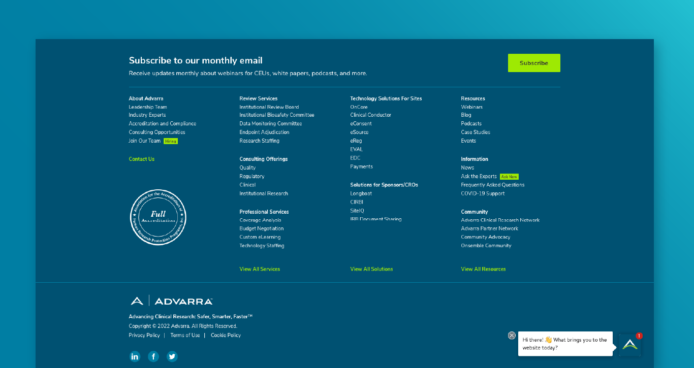
A Good Footer is a Good Sitemap
The footer is essentially the websites' site map. It places all the pages outlined in the main navigation in a skimmable list at the bottom of every web page on the site. This is a great fail safe if your user cannot find what they are looking for in the primary nav.
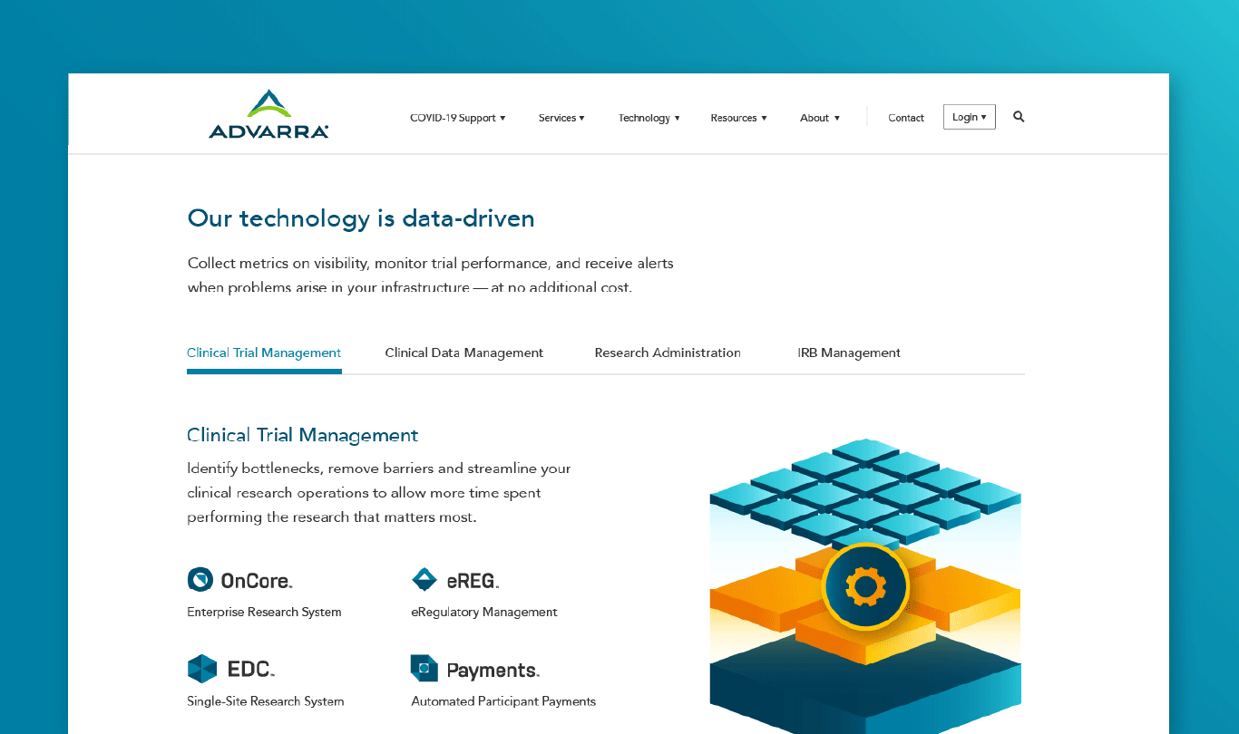
Interactive Carousel Content Block
This content block is super flexible and aims to keep landing pages a manageable length. This block is used most often on solution parent pages like "Review Services" and the interactive carousel would have the four child page offerings to interact with and link to.
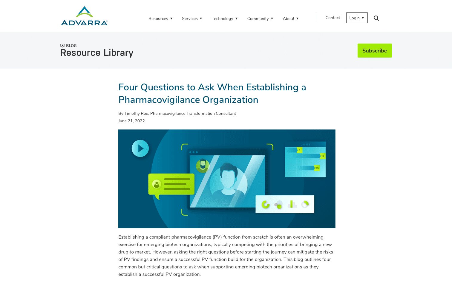
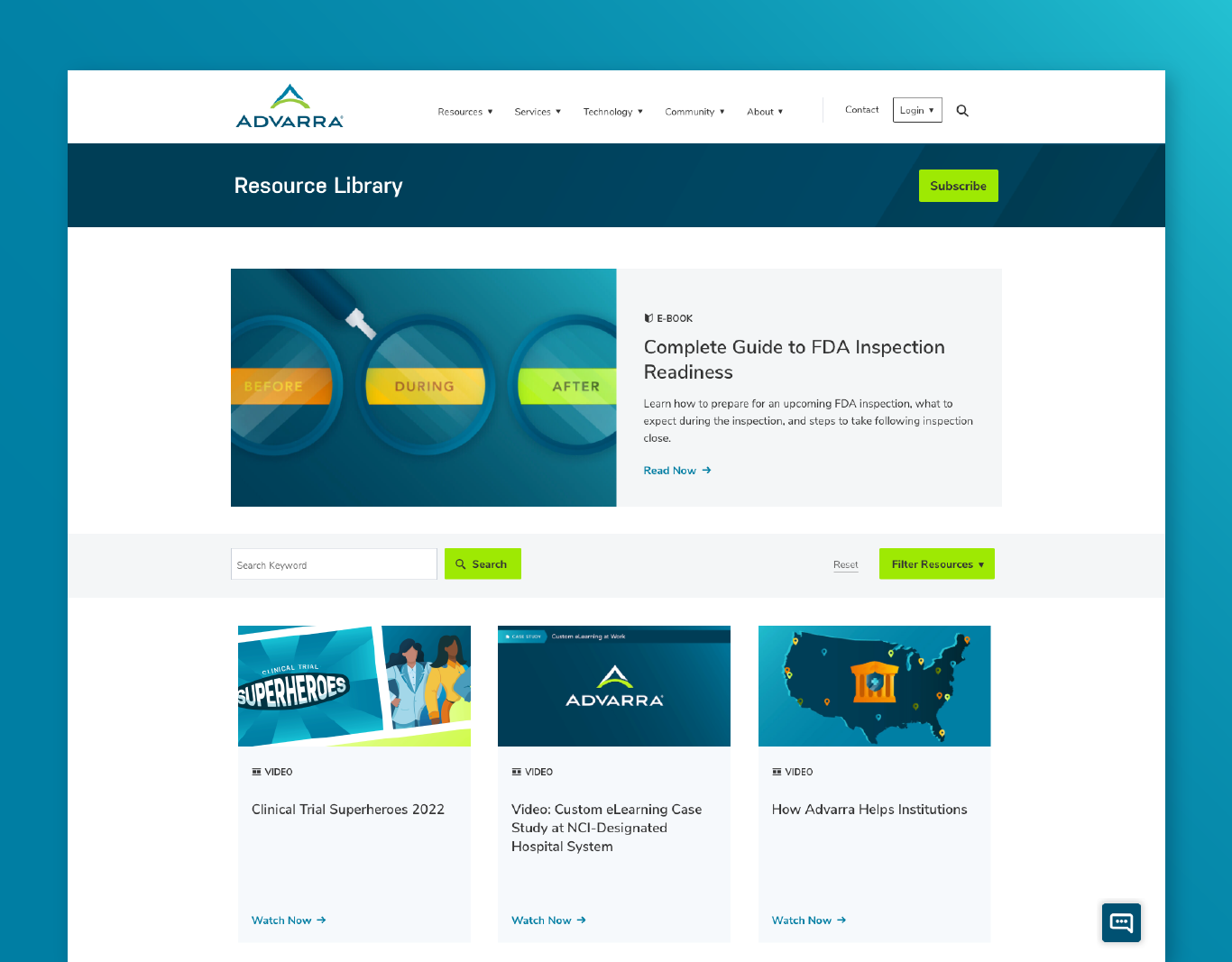
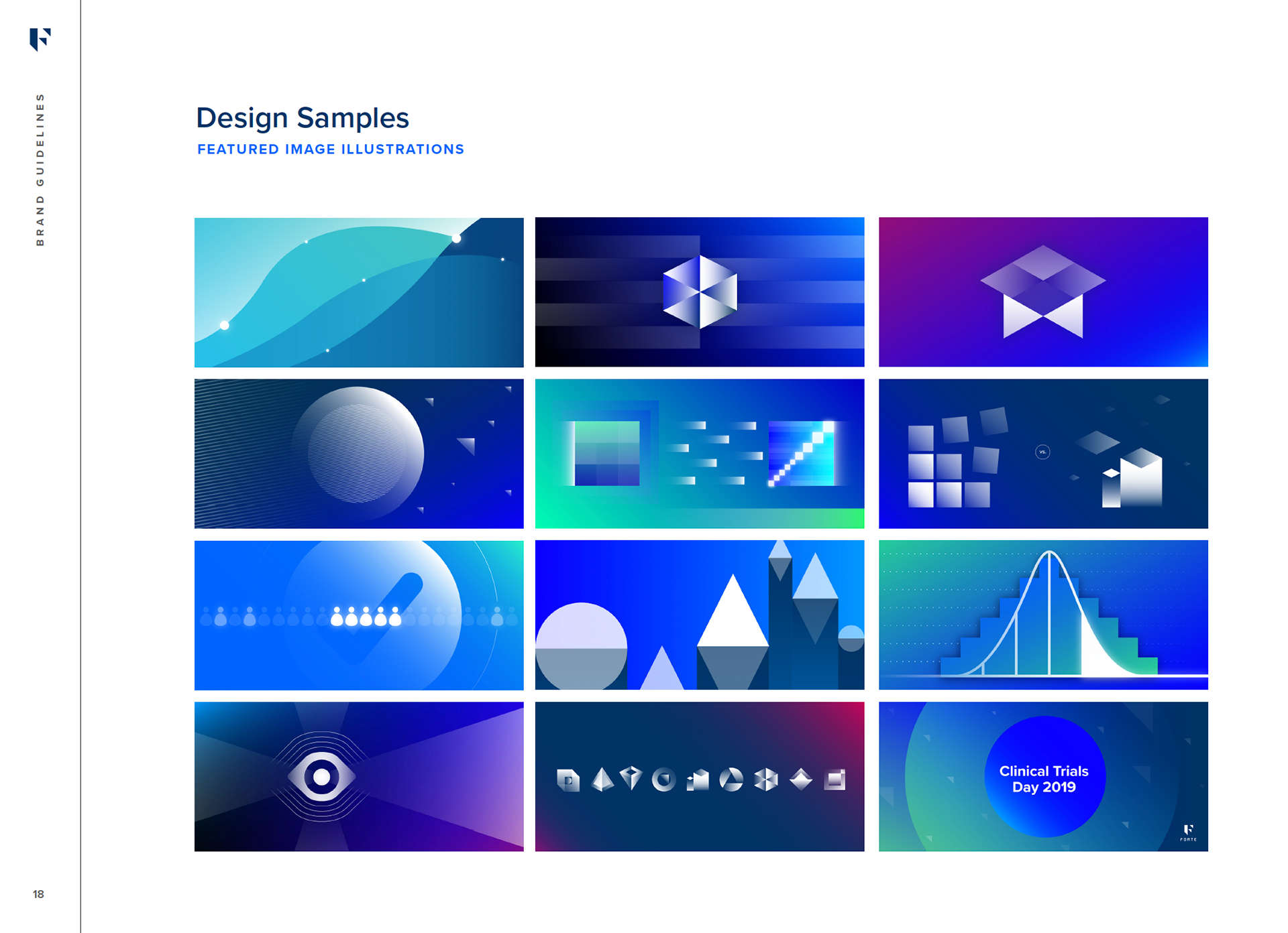
Resource Library
The Advarra Resource Library was developed prior to the full web re-design in 2021. This informed a lot of our CSS style updates like button states, links, UI colors, heading and body copy styles, and resource icons. Unique featured images are used to give our content an element of visual flair that encourages users to navigate to our site from social media.
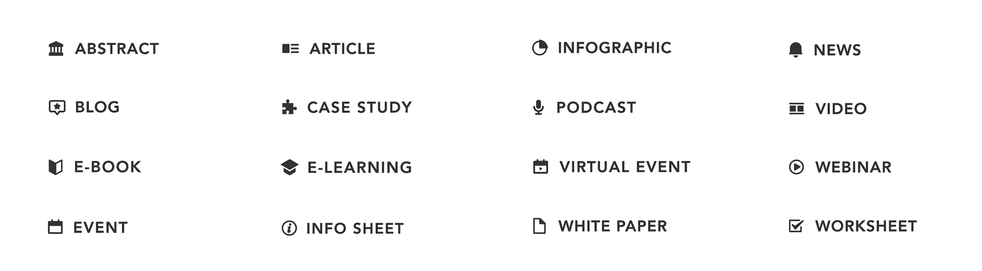
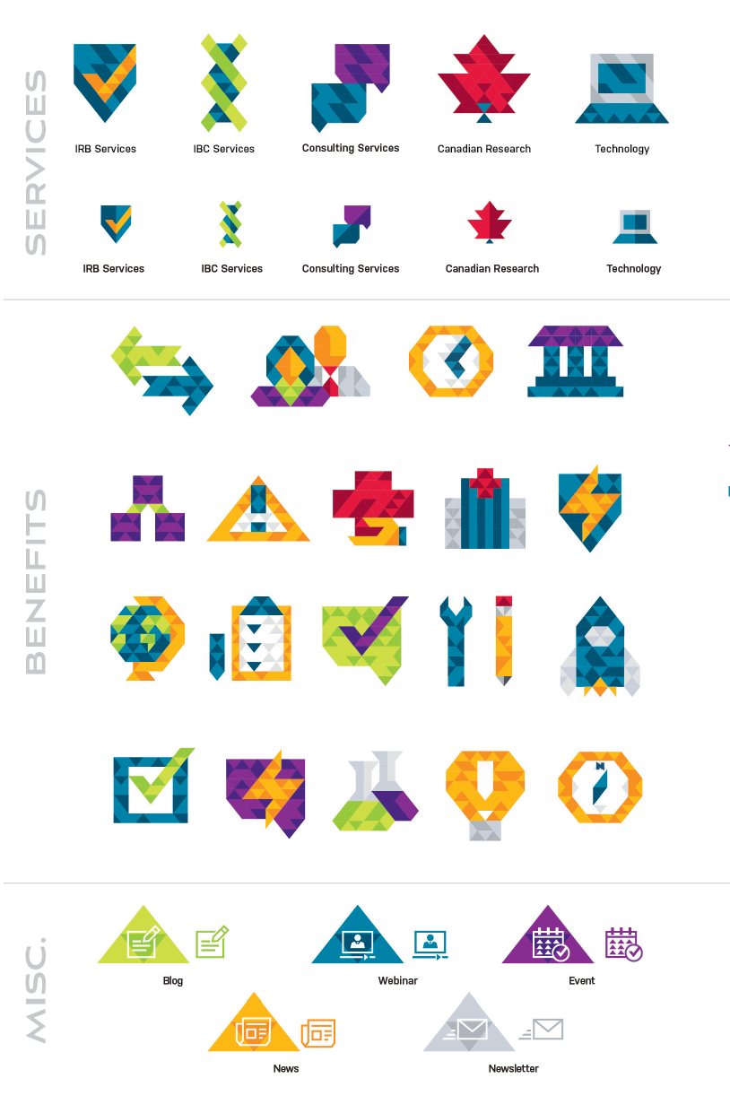
Resource Icon Library
This icon family is used to visualize the robust content offerings Advarra provides their users'. This style improves secondary navigation, enhances accessibility, and provides informative visual cues for the user.
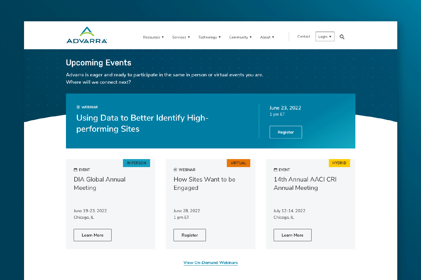
Events Page
The events page was a home for webinars, hosted events, attended events, and as a location to show the Advarra culture — essentially, make it visually enticing for someone to visit our booth.
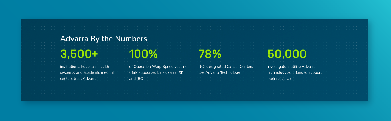
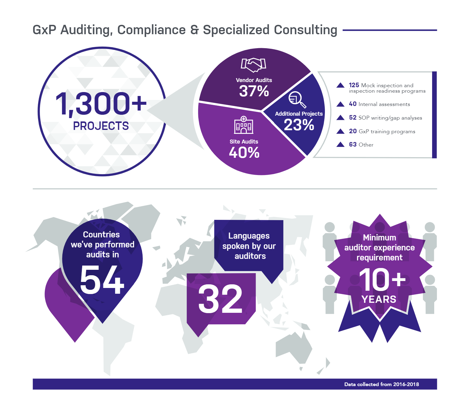
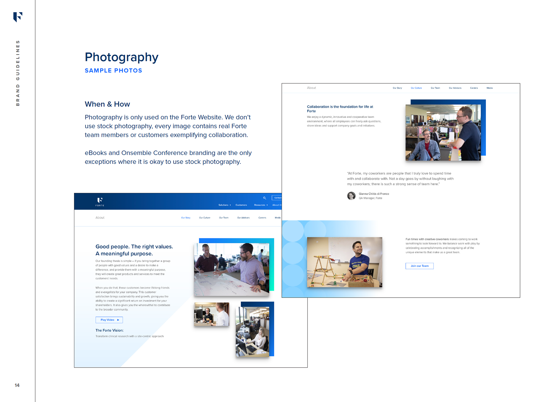
Proof Points
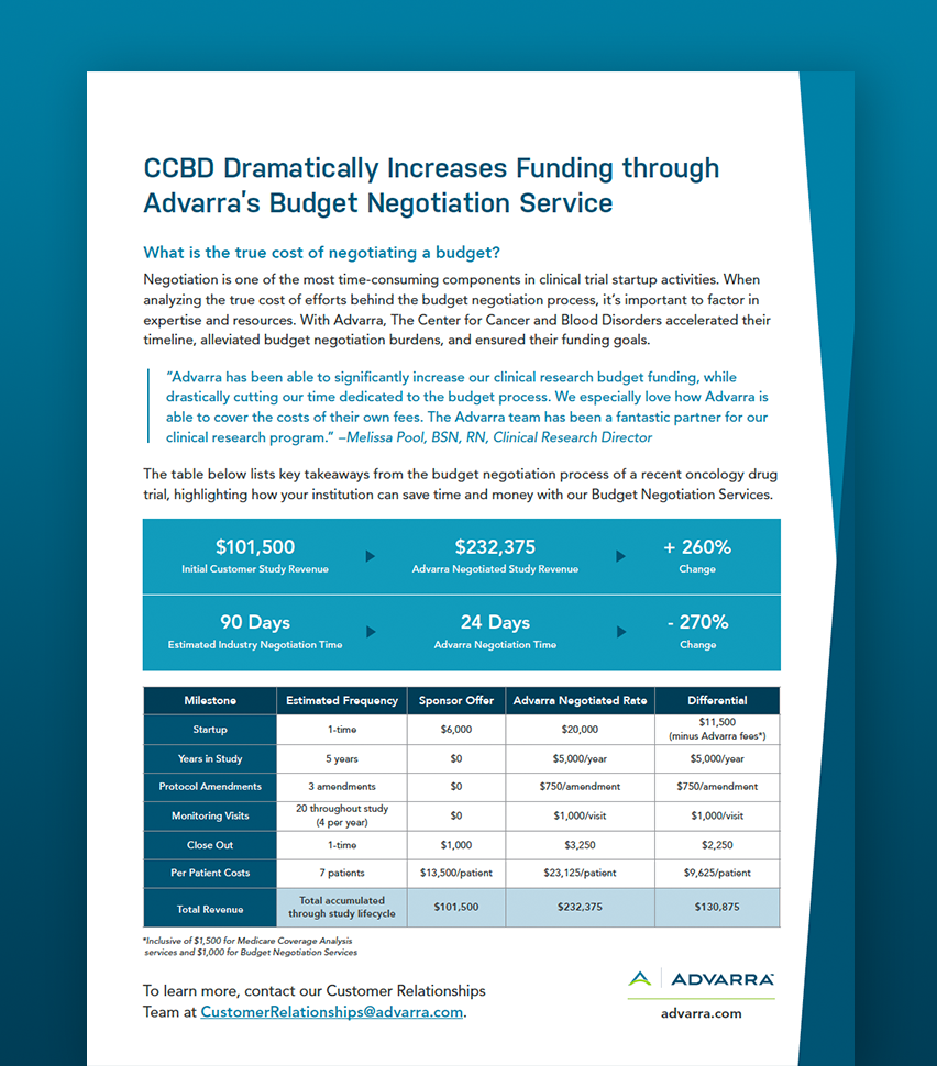
The old Advarra website lacked in proof point elements like the below testimonial block and number call outs. The testimonial block is very flexible and can be modified depending on the permissions we have from the customer to use the following: the customer quote, case study card, and customer logo.
The number call outs are a great way to show brief statistics in a visually pleasing way. These are very flexible and can be utilized in 2-, 3-, and 4-column layouts.

The Rebrand: a Case Study
What is Advarra?
Advarra provides integrated clinical research solutions that safeguard trial participants, empower clinical sites, ensure compliance, and optimize research performance. Advarra was establised in late 2017 as a result of the merger between Schulman IRB and Chesapeake IRB. The company primarily started out as a central IRB and then grew exponentially with the acquisitions of technology, professional services, and consulting companies.
Who is our audience? Cancer centers, academic medical centers, health systems, CROs, sponsors, patient advocacy groups.
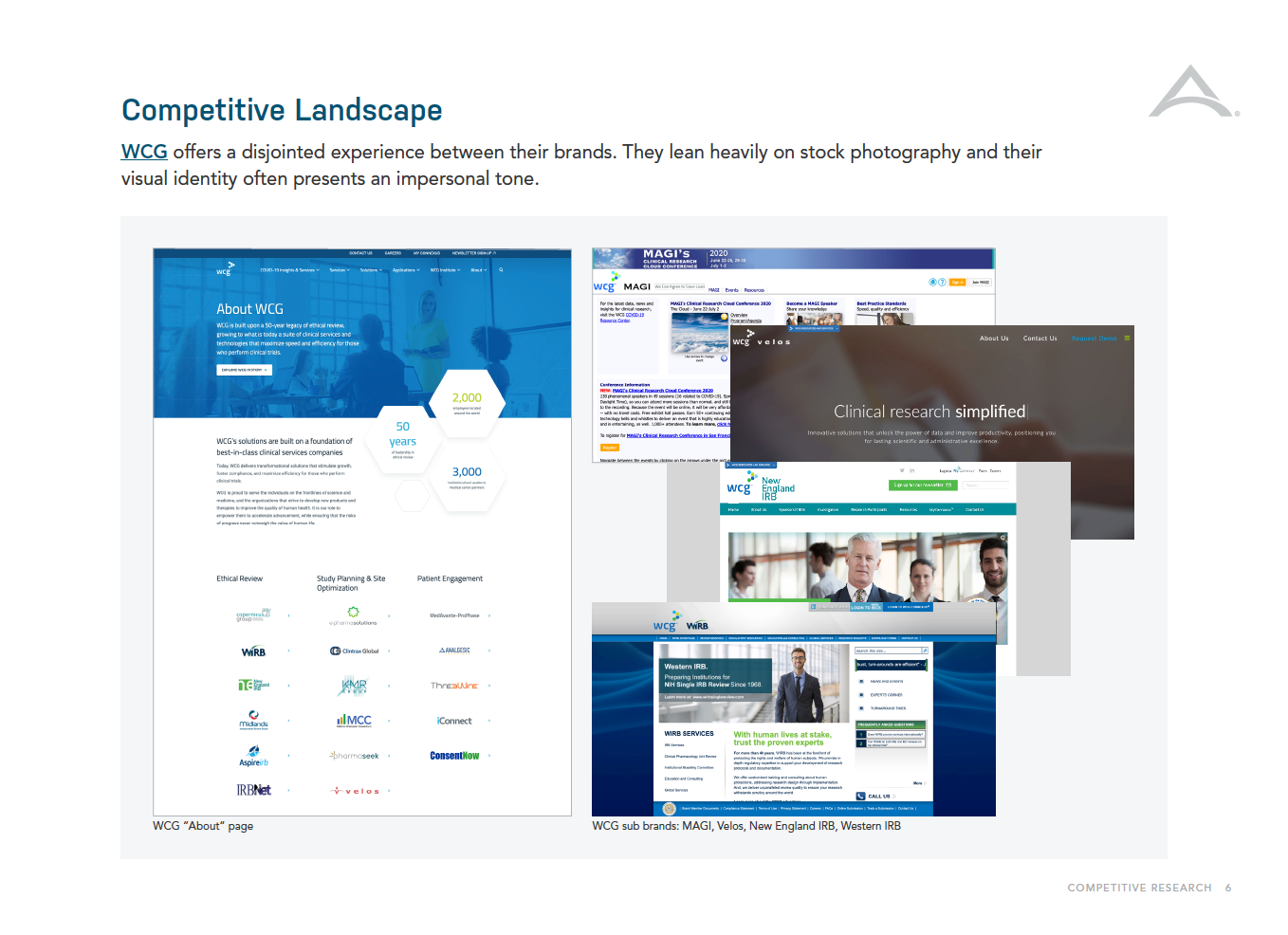
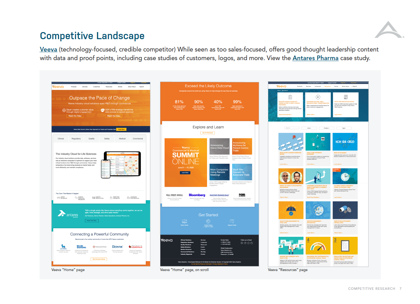
Who are our competitors? Our primary competitors offering a similar suite of integrated solutions are WCG and Veeva, but there are many more in the individual lines of business that we looked into but didn't focus our energies on.
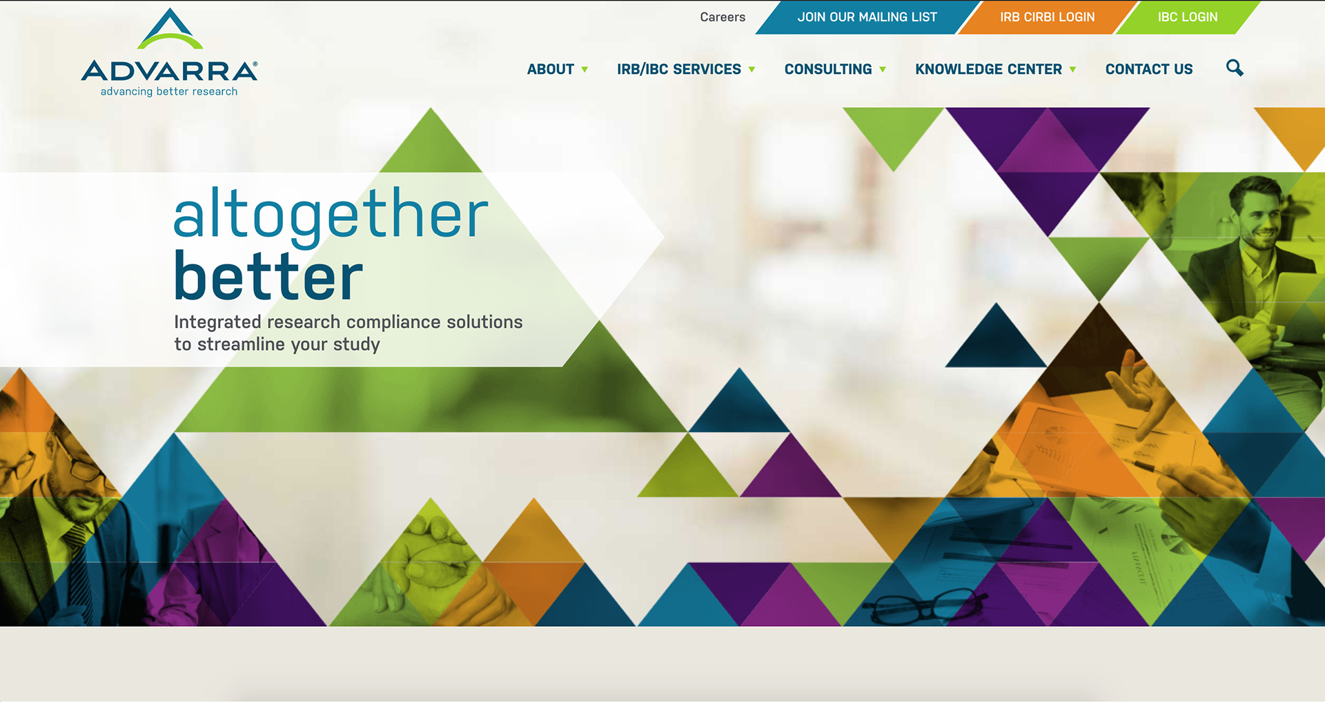
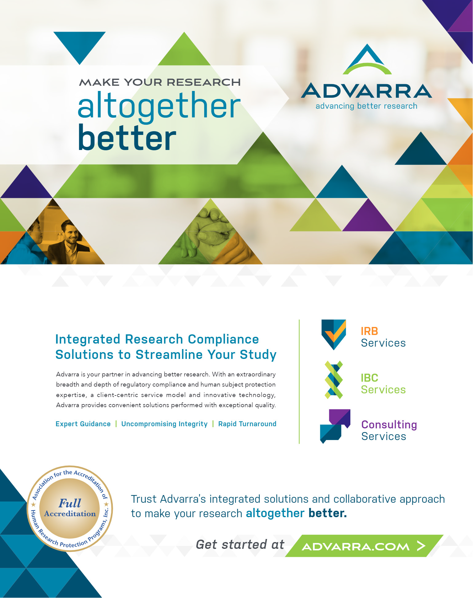
The 2017 branding
The 2017 Advarra brand was created by SCORR Marketing who developed a vision that was based on conceptual art. The triangles were introduced as a reflection of the “A” logomark. Triangle elements, photos, logos, and icons were arranged in a grid formation with matching proportions. They utilized design principles like continuity and structure to symbolize the merging of the legacy organizations and meeting challenges with strength.
The visual identity relied on stock photography with triangles overlaid on photos. The images emphasized the task at-hand and when combined with an out-of-focus background image, they were presented as “bringing your research into focus.” The conceptual facets were lost in translation for our customers. Without the support of those concepts, the triangles, stock photography, and muted color palette overwhelmed viewers.

CEO Interview and Vision
We interviewed Advarra's CEO to discuss what kind of branding he hoped to see for the company. He was drawn to the simple and clean design style that Forte had created in-house in 2017. That brand was highly abstract which we knew from the 2017 SCORR marketing re-brand wouldn't quite work to tell our story, but it gave us a place to start designing a new brand.
Our Solution
Ultimately, the SCORR brand had a few good bones, so this wasn't a total overhaul. We were able to keep the logo, most of the colors, and some of the fonts. The key areas we targeted as needing a complete re-design were patterns, illustrations, icons, graphic elements, and a new suite of product logos.
One of the biggest missing elements in the SCORR vision was a functional illustration style. We knew we wanted to move away from the heavy triangle presence of the tangrams – so brainstormed a new style and after several explorations landed on the one below.
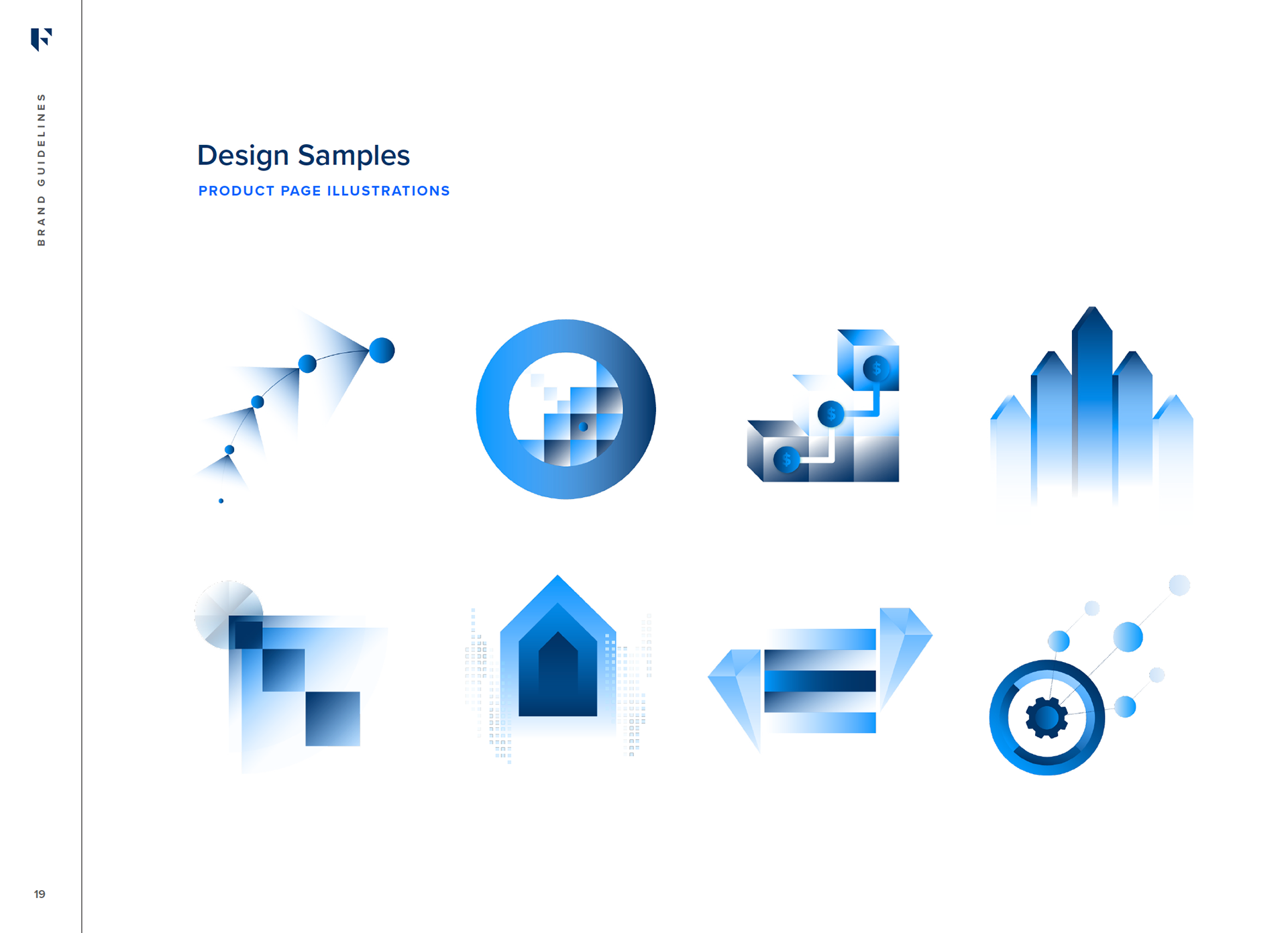
Illustration Style
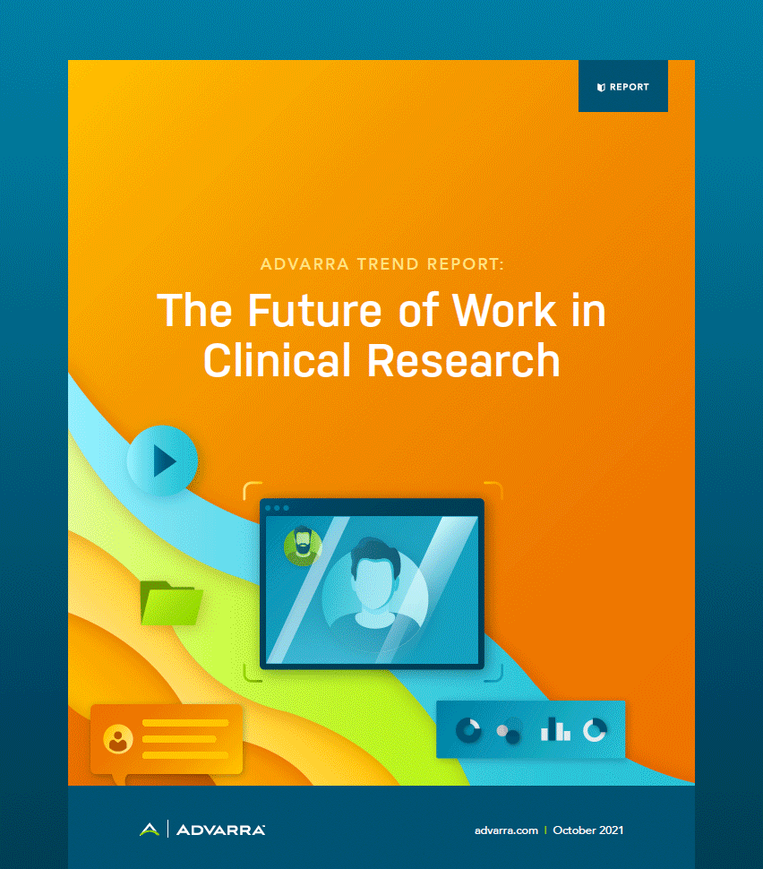
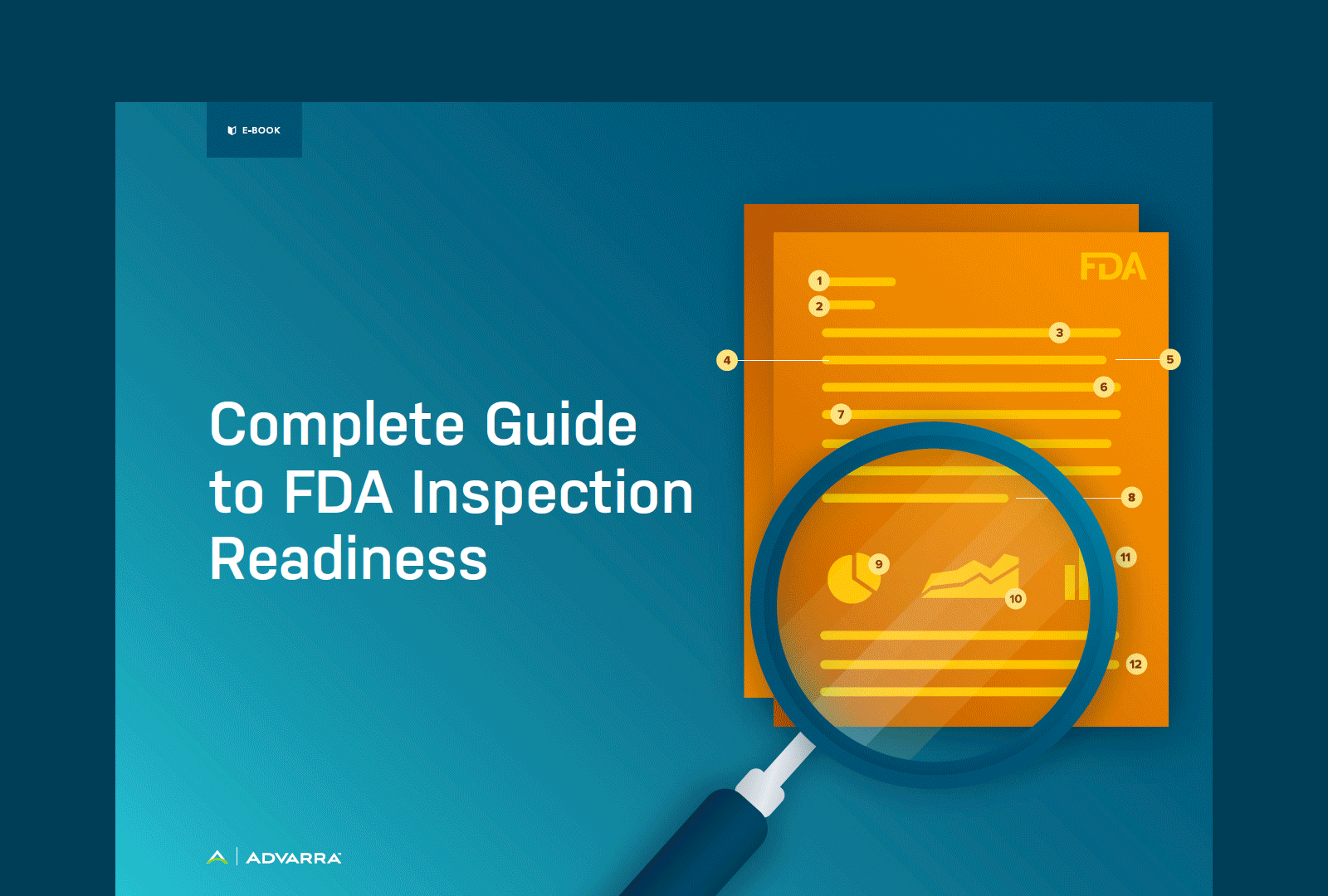
The illustration style is a gradient-based concept that focuses on light sources and shading to create depth resulting in professional, semi-realistic form. These illustrations can be broad enough to signify company-wide value props or narrow enough to express specific functionality within a product.


The second area we needed to grow was our iconography and product logo suite. The SCORR team had created a library of color-coded tangrams for service line offerings and a modified set of tangram icons. These were time-consuming to create, lacked in detail, and restricted brand variety.
Icon Library
The icons we created were simple and straightforward, a direct juxtaposition to the tangrams.

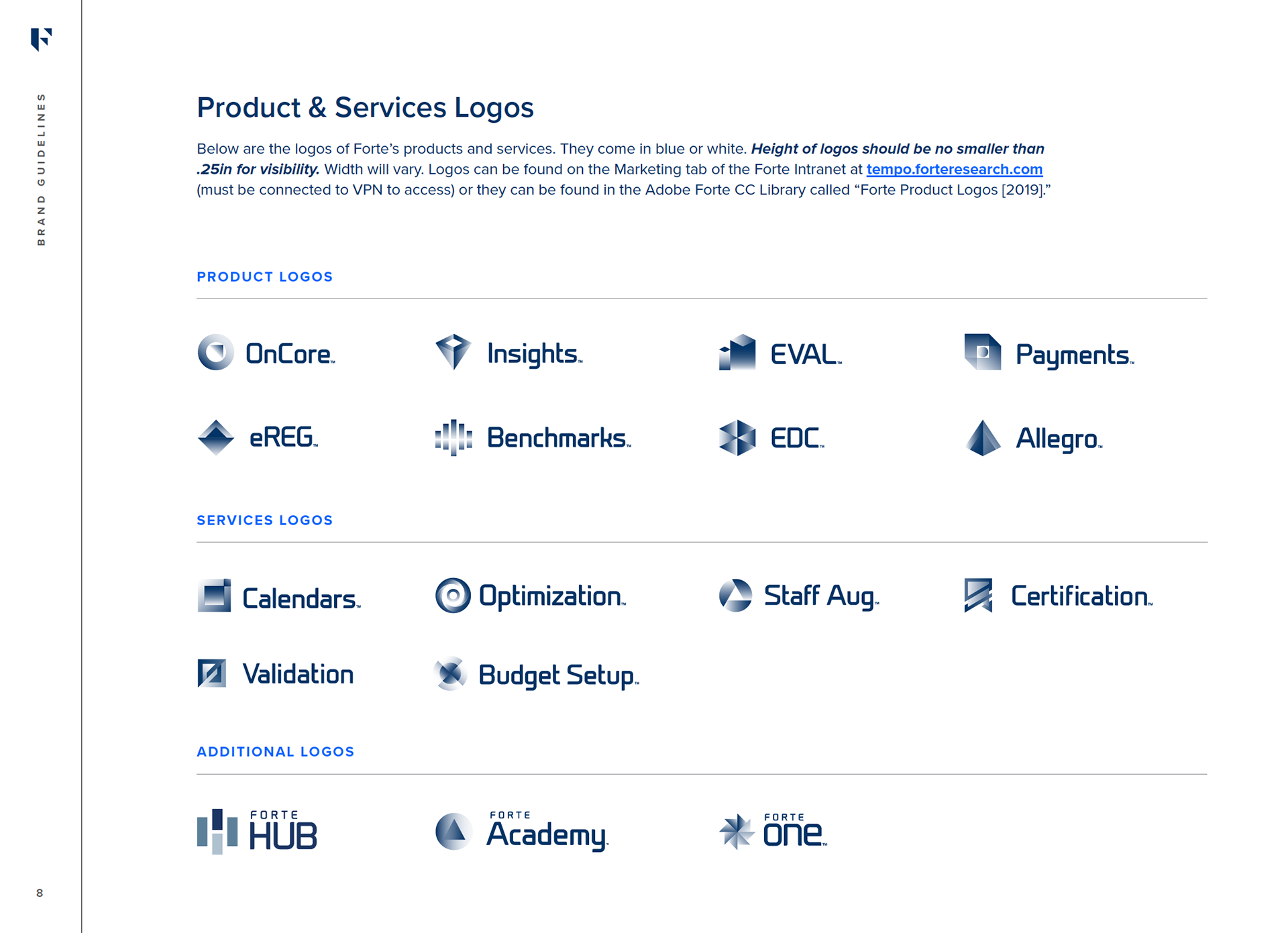
Product and Service Logos Brand Update
The new product and service line logo suite was informed by the former Forte logo suite to maintain brand recognition for products. I simplified it from a gradient heavy design and updated fonts to match the Advarra brand.
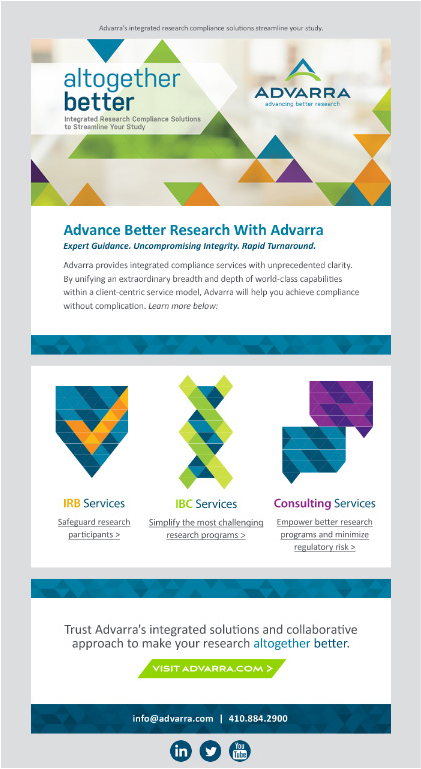
How do these elements look in application?
As exciting as these updates were, we needed to test them across several channels to show how the brand looked in practice, especially in thought leadership materials. This brand showcases our exceptional content without distracting from it's message.
Educational Content
A large chuck of my teams' day-to-day work is spent on creating educational content for the Advarra Resource Library. That includes everything from eBooks, infographics, case studies, white papers, reports, featured images, and educational videos.