
Learning is far more than just gaining knowledge. It's the inherent curiosity, imagination, and surprise at the unexpected discoveries that happen in everyday interactions — the ones that inspire us to explore in the first place.
Primary Logo Creation: Koto Studio (LA)
Art Direction + Design: Katie Krull, Remy Usman
Copywriting: Emily Ciccariello, Courtney Petersen, Edward Babaian
Creative Direction: James King
Art Direction + Design: Katie Krull, Remy Usman
Copywriting: Emily Ciccariello, Courtney Petersen, Edward Babaian
Creative Direction: James King
The Pear Deck Learning Origin Story
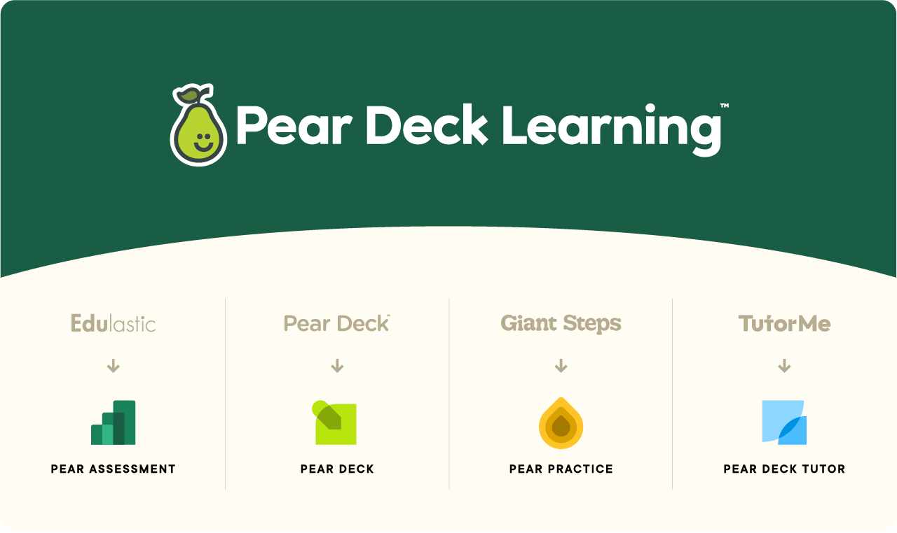
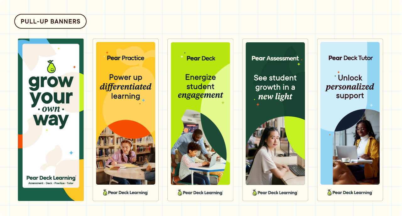
Pear Deck Learning is a powerful suite of curriculum and instruction tools that assess progress, offer real-time feedback, and provide differentiated instruction that keeps students engaged and excelling.
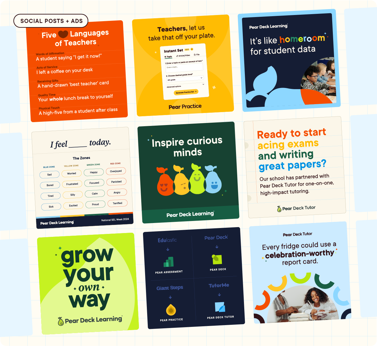
Pear Deck Learning launched in January 2024 consolidating four products (Edulastic, Pear Deck, Giant Steps, and TutorMe) across the learning journey: assessment and test prep, student engagement and active learning, differentiated instruction and gamified collaboration, and personalized 1:1 tutoring support.
Flexible Design System
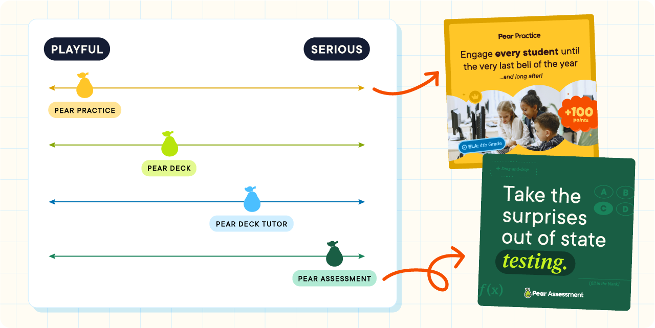
Pear Deck Learning's products meet students and educators at different parts of the learning journey. This journey gave us a solid foundation to create a design system and brand tone that could flex from playful to serious across occasions and channels. For example, a teacher experiencing Pear Practice (our gamified practice tool) on TikTok would find us more playful than an administrator receiving an email from Pear Assessment about it's Data Warehousing functionality.
Color
Our color palette is derived from shades found in a student's everyday learning environment. The mix of bold, energetic colors evoke a strong sense of joy while the soft, earth tones help root the brand to our core pillars — efficacy, privacy, and equity — fostering a sense of trust and competency.
This palette can flex into darker shades and lighter tints for user interface design and illustration.

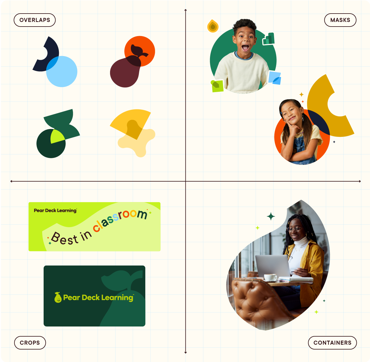
Shapes
Pear Deck Learning uses a range of brand-specific and simple shapes that flex on the playful to serious scale. These shapes are the building blocks of the brand system. We use them to mask photos, as cropped background elements, in patterns, as containers for text, framing devices, overlapping elements, and more.
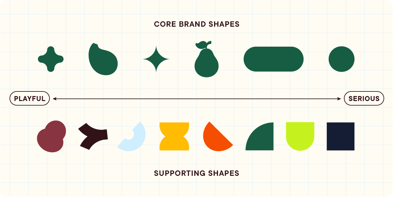
The versatility of this collection of brand shapes allows for the creation of a large array of dynamic and engaging layouts.
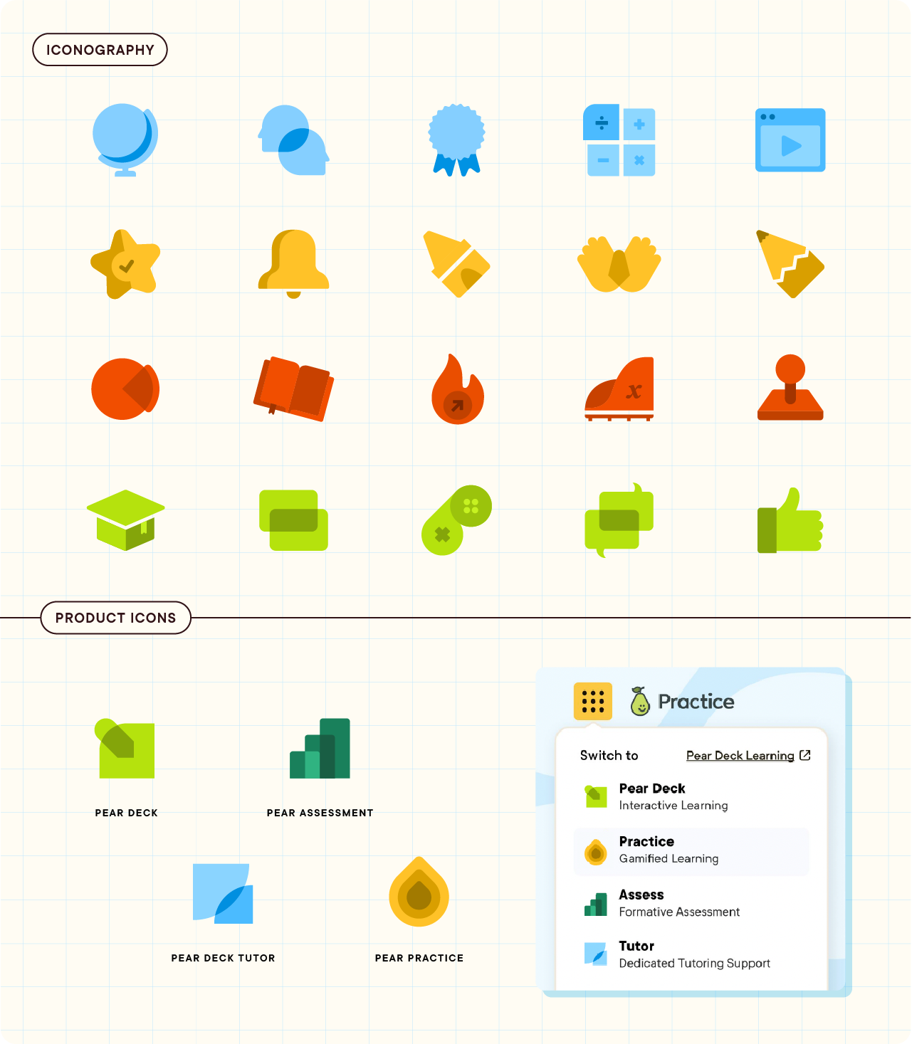
Iconography
The icon style I created for this visual identity maintains a consistent style with overlapping, simple shapes to depict abstract concepts or ideas in the education space. The monochromatic icon set can be mixed and matched or utilized in a single color-way depending on the tone and objective of the piece.
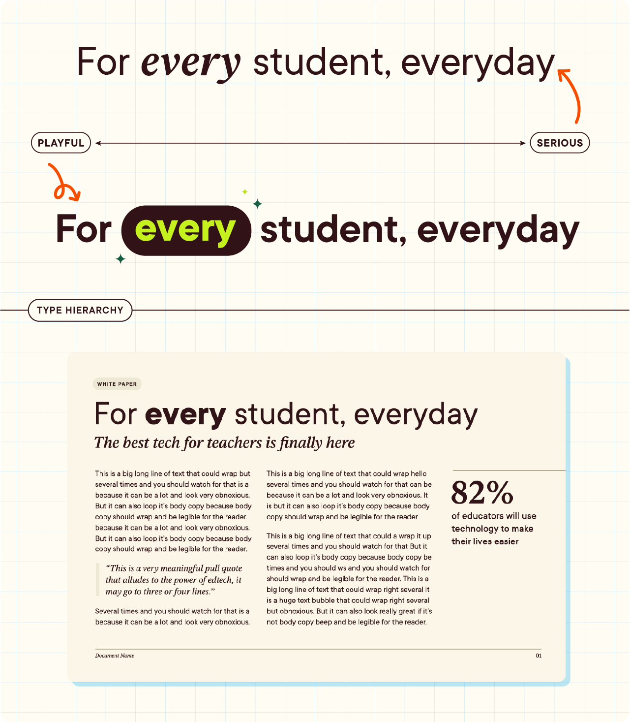
Typography
The type system we chose unites a workhorse of a san serif, TT Commons by TypeType, with an editorial serif, Ivar Text by Letters from Sweden. Ivar Text is used to create emphasis for important words and phrases.
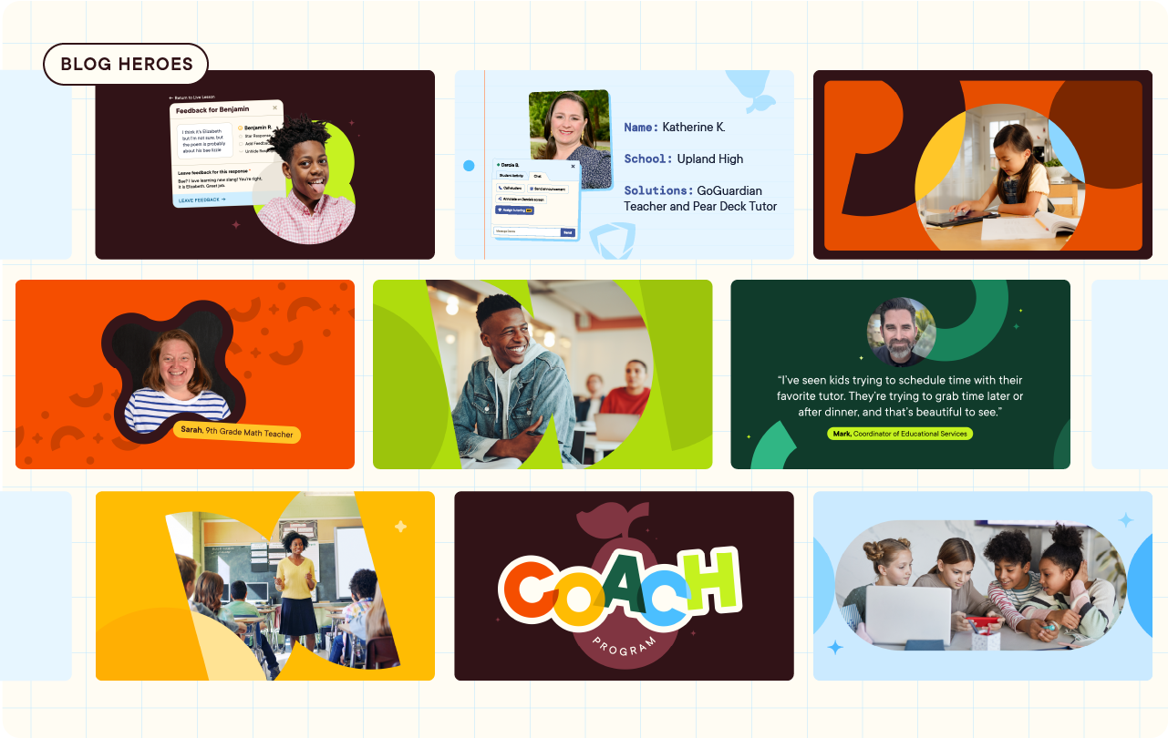
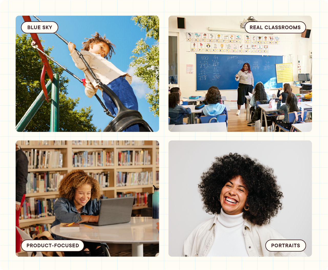
Photography
Our photography falls into three buckets, all of which places subjects in bright, natural, and optimistic environments that are grounded in the real-world aspects of learning and collaboration. Blue sky images embrace a sense of limitless optimism and potential. Product-focused imagery highlight the convenience and mobility of the brand. Portraits highlight the diversity of our users' personalities and their experiences.
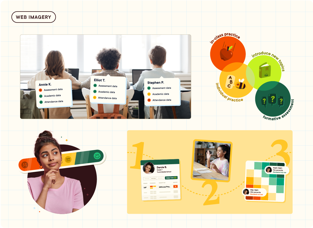
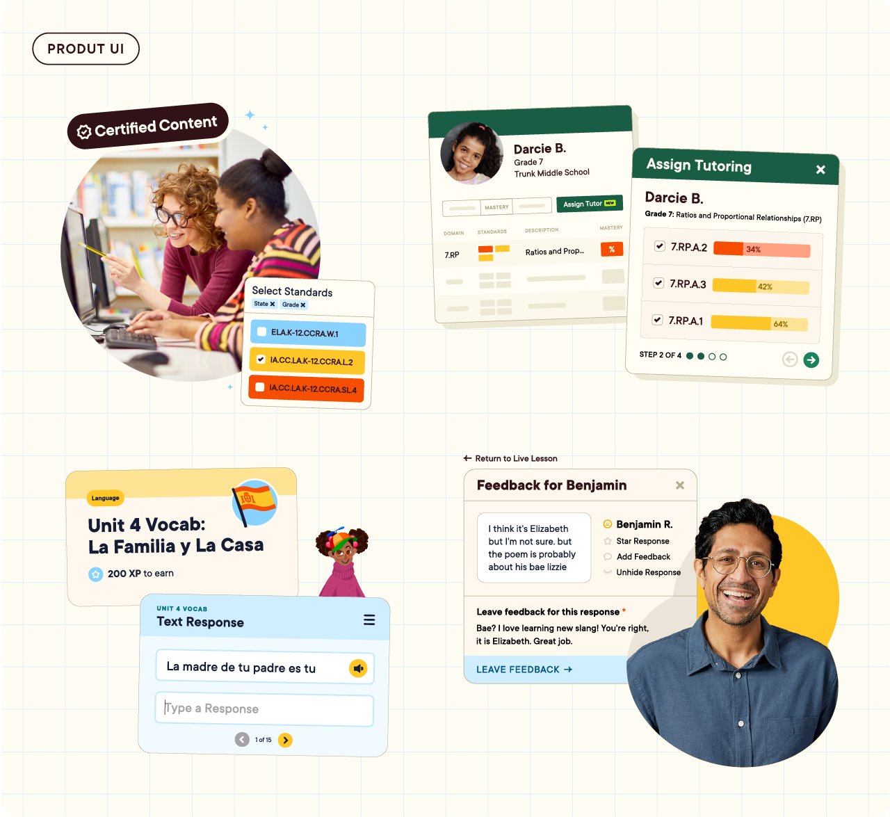
Abstracted Product UI
The brand also leans into abstracted UI moments from the product experience to give users more digestible visuals of what these products can do. At times we pair abstractions with a portrait or classroom shot to provide context about who uses each product and when or how they might use them during the day.
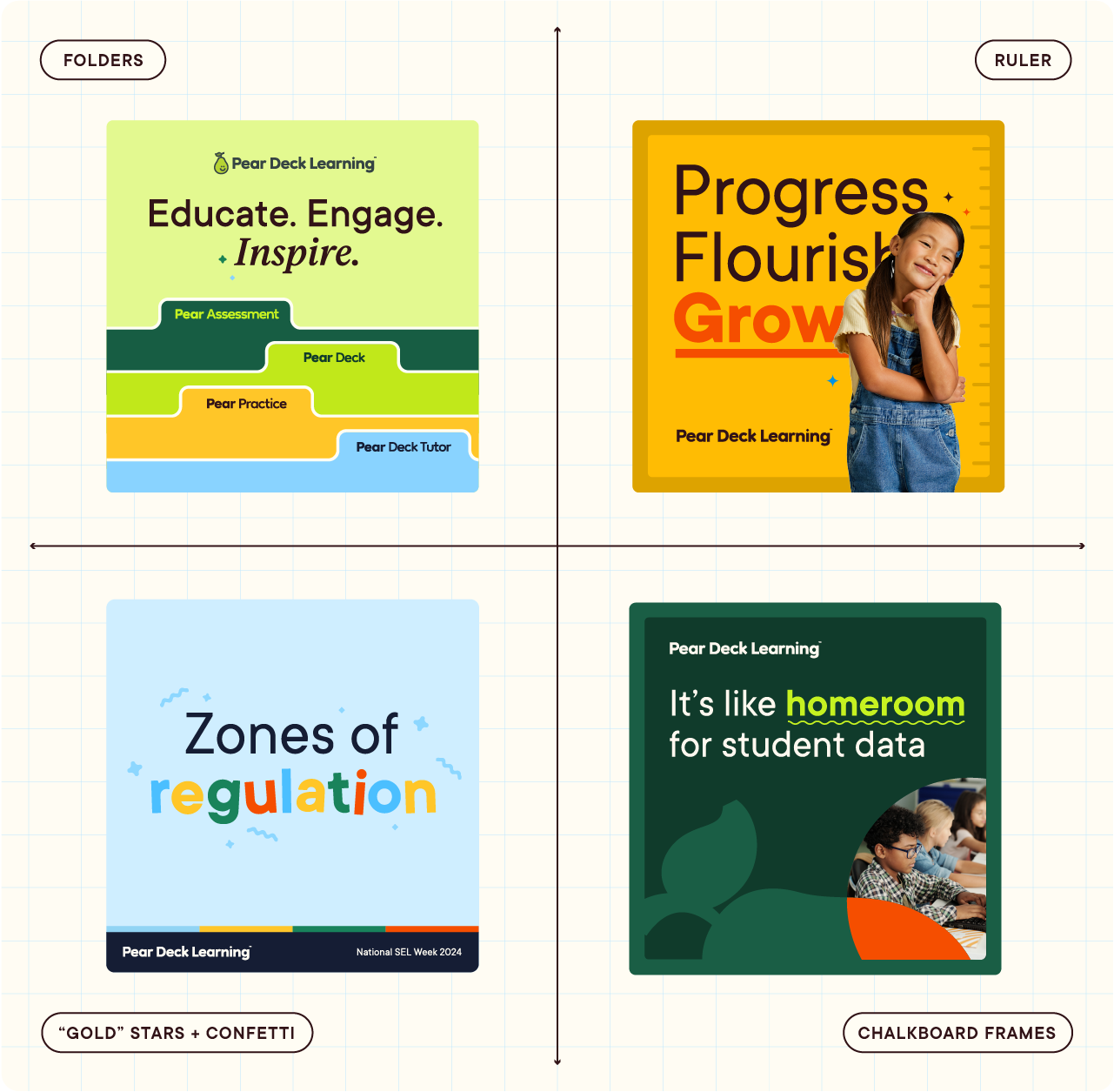
Additional Design Motifs
This visual identity also employs some design motifs specific to the physical school environment like folder tabs in a trapper keeper, a ruler as a visual metaphor for growth, stars and confetti to celebrate positive learning outcomes, and lastly a framing device to mimic a chalkboard or whiteboard in a school.
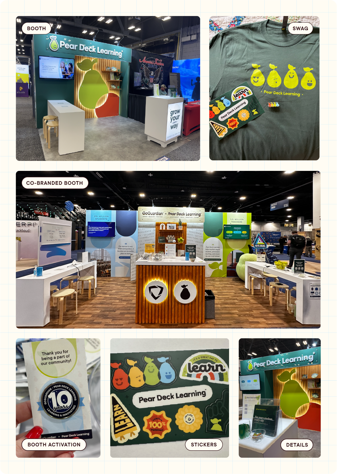
Events and Swag
The following images are a sample of our event spaces and swag for customer giveaways. Our event spaces should be an inviting and professional location for our sales team and subject matter experts to have discussions with customers and prospects.
Social Media + Paid Ads
The following images are a sample of social media posts and paid social ads. You really get a sense for how playful the brand can be on social.
Website
I steered the creative approach for the Pear Deck Learning web build with an external agency (Supervillian), created all site imagery, and performed quality assurance testing during the week of launch.