My Forte Origin Story
I was hired as Forte's designer in July 2018. The Forte marketing team had just launched the new Forte brand and website in late summer of 2017. It was what enticed me to apply in the first place, it was overflowing with good design. That being said, how do you make an impact on an already successful brand?
That first three months a lot of my energies were focused on learning and replicating the brand, which was more challenging than I thought it would be. I was a team of one designer with a very new brand in my hands. My manager was a web developer with strong design chops but was out on maternity leave for my first three months.
So where did I start?
Featured images. It's a tale as old as time, giving strong educational content an equally strong visual presence. This was how I learned the brand, iterating and building on designs my predecessor had created.
My Manager Returns!
Just when I thought all I would be creating was featured images for the rest of my life, my manager returned! Remember the web developer I mentioned earlier? She was awesome and inspired my love affair with UI design over the next four years.
We started slow by updating some low impact pages on the Forte website like the following Webinars resource page. Previously the look had been a two-column approach with a large jpeg card on the left and a meta description on the right. The jpegs were headshots of the webinar presenters but were often poor quality photos or the presenter had no headshot, which didn't make for a very consistent experience.
OnCore Login Page
My manager and I became a dream team tackling long-standing design projects that had yet to be updated from the re-brand. The OnCore (Forte's flagship product) login page below was a page that had been stuck in the pre-2017 rebrand world. We worked with the OnCore dev team to launch a new page highlighting the RSS feed of new educational content on the Forte website.
Playing with Design Systems
My manager encouraged me to get out of my comfort zone and work on some design projects with the product teams. At the time, there was no visual advocate for brand consistency across products.
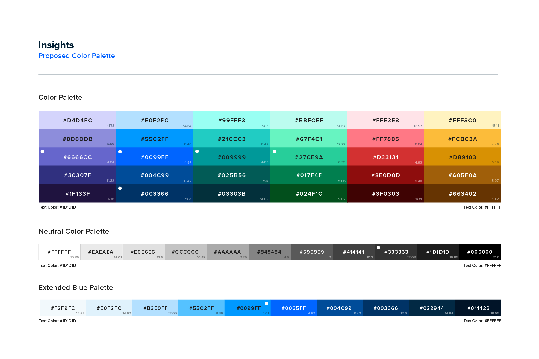
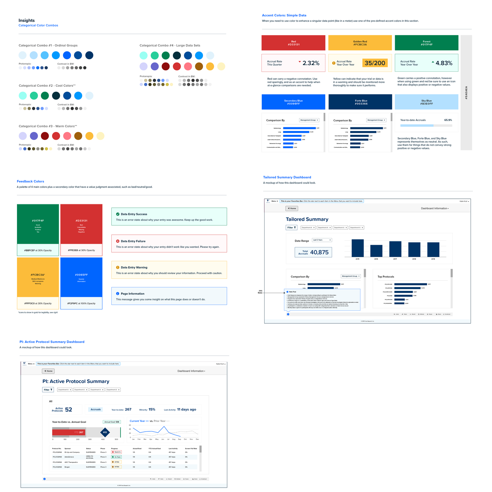
I started to moonlight as a UI designer with the Insights Product Team on a design color system. Insights is an application that tells a research sites story through data viz. The Insights team needed a color system that could tell a lot of different stories: positive, negative, ordinal, and neutral data. We developed a new palette around the primary and secondary palette of the Forte brand.


Favicons in the Wild
The favicon design system was updated to reflect the new product logo updates from the 2017 rebrand. The favicon family is used as a visual cue on the left hand side of the browser tab to navigate on the web. These favicons help improve user experience.
The challenge with the project was that the favicon needed to function well in both light and dark mode treatments. This meant we needed to sacrifice the size of the product icon in favor of giving it a colored background that was accessible on both screen modes.
Forte's Very First Icon Library
This icon library was something I was so proud of. It was my first fully designed and consistent set of icons I'd ever created. Below is a sample from the set of 130 original icons.
What else did I do at Forte before they were acquired?
Being the only designer at Forte, I was quite busy with other projects that aren't reflected here. Here are some highlights that made the cut but live on different parts of my website:
Onsemble Conference
Onsemble.net Rebrand
Stars and SMEs Logo - The logo has since been updated to Advarra branding.
Forte Fiesta Logo
ISO 27001 Logo
Onsemble.net Rebrand
Stars and SMEs Logo - The logo has since been updated to Advarra branding.
Forte Fiesta Logo
ISO 27001 Logo

